The spa town Bad Vöslau, just 30 minutes south of Vienna, is home to one of Austria’s most beautiful thermal baths. A little oasis of quietly refined elegance on the foothills of the expansive Wienerwald forest.
The clean spring water sold under the name Vöslauer is among the country’s best-known brands. But the area is equally well known for its wines. Both Burgundy varieties and local grapes get plenty of sun on the hills overlooking the Vienna Basin.
This combination made it a popular summer vacation spot for Vienna’s high society in the 1800s. Today, the old villas and grand parks tell stories of its past fame.
But the historical resort town is anything but sleepy! A new music school and concert venue in nearby Gainfarn Castle opened at the end of 2023 and the city center is undergoing big changes to become even greener and more pedestrian friendly.
Driven by the input of Bad Vöslau’s engaged public, which was included in the identity and design process through multiple public workshops, the team at message marketing has created a new brand identity for Bad Vöslau that combines the town’s core strengths into a strong vision and a coherent story.
At the center of the new visual identity is the exclusive house font AQVA, which was drawn with inspiration from classic art nouveau lettering.
The wordmark is set in a slightly bolder version of the same typeface, with characteristic details like the LA-ligature and a compact single line umlaut (sometimes called a Swiss umlaut).
Since a city has to communicate a wide range of topics (from parking tickets to summer festivals) to very different target groups, the design allows for both elegantly muted and more expressive colourful layouts. But the tone of voice is always friendly and with a refreshing lightness.
After all, Bad Vöslau is the place where a good life comes easy – “wo gutes Leben leichter geht”.
This project has been shortlisted for a City Nation Place Award in the category Best Use of Design.
Art Direction, Type Design
at message marketing, 2023
The historic city of Waidhofen/Ybbs is located in a valley next to the Ybbs river. But its people don’t fit the stereotype of closed-minded villagers – instead, the city is home to successful businesses and a thriving cultural center. The minimalistic steel and glass box, designed by star architect Hans Hollein, on top of Rothschild castle, is a testament to this spirit.
The city already had a very good logo and visual identity, but lacked a broader range of visual tools for marketing applications. Together with a team at message marketing, I developed new guidelines that expanded the existing design with a custom-designed font, new colours based on the city’s charming old town and a flexible toolbox for print and social-media.
At message marketing
2020
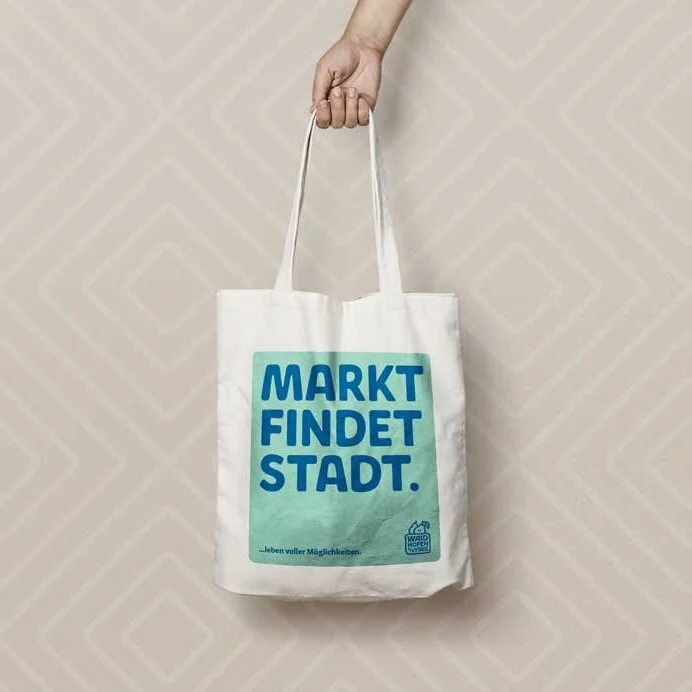
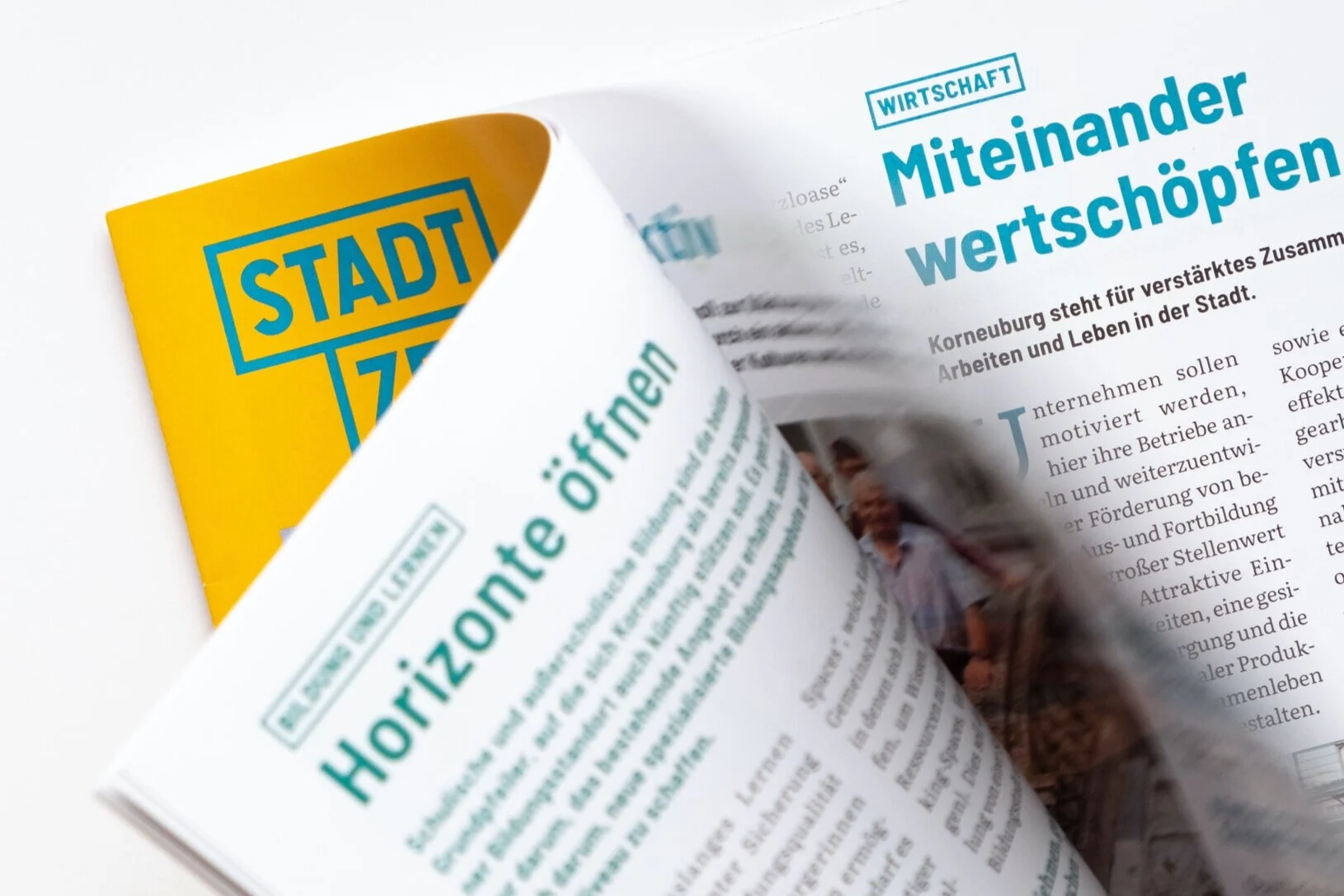
Korneuburg is a city on the Danube just north of Vienna, Austria. As part of a new CI for the city, I also created a new design for the city newspaper which combines useful information from the city hall and council with articles about local events and personalities in an attractive magazine format.
The design of the title echoes the city’s new logo, which is based on stacked bricks.
At message marketing, Vienna
2020
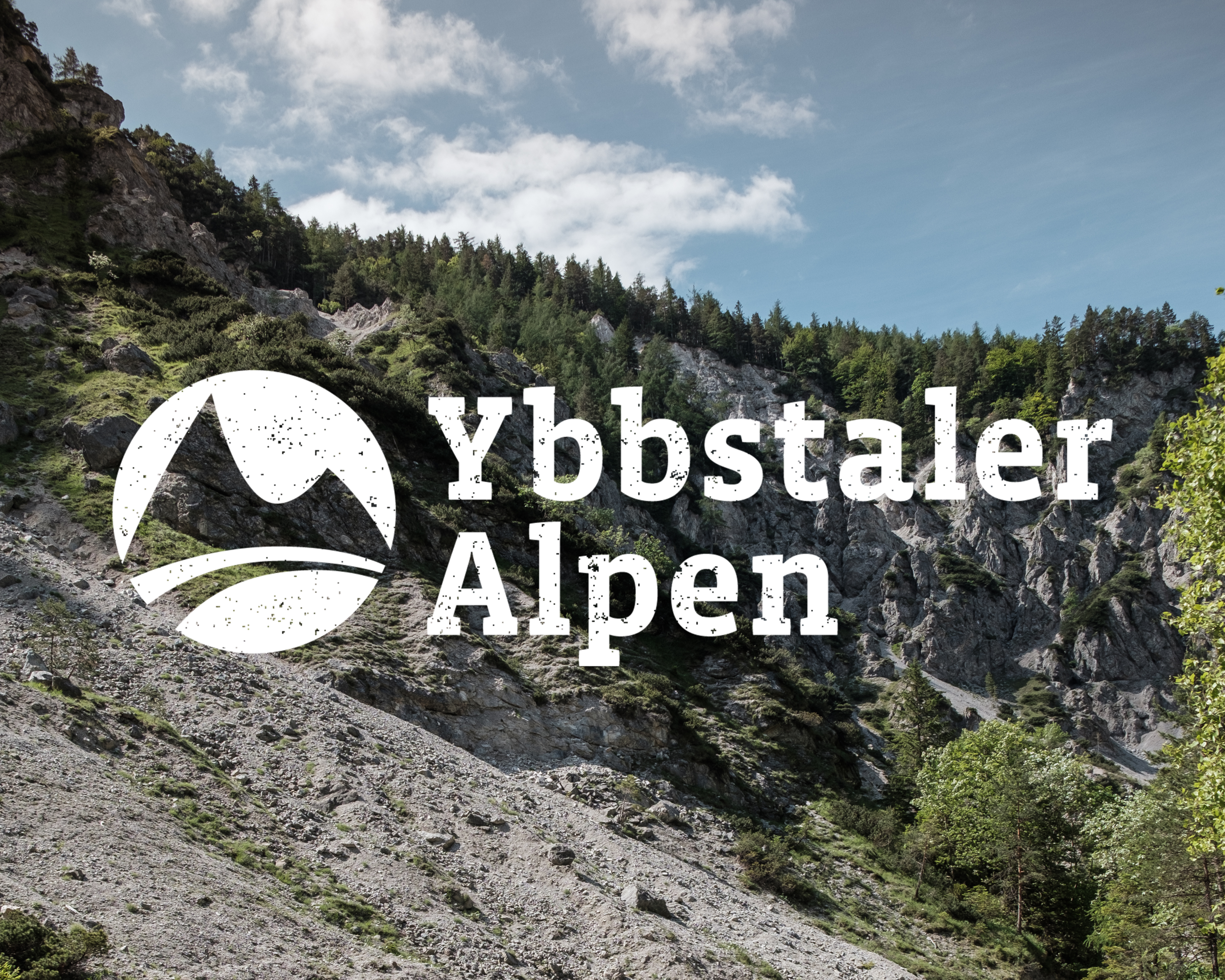
Logo for the Ybbstal Alps, a mountainous region in Lower Austria which attracts many visitors all year round for hiking or winter sports.
The challenge was to give the area it’s own recognisable identity within the existing framework of the larger Mostviertel area and to create a concept that could also be applied to other sub-regions in the future.
At message marketing, 2020
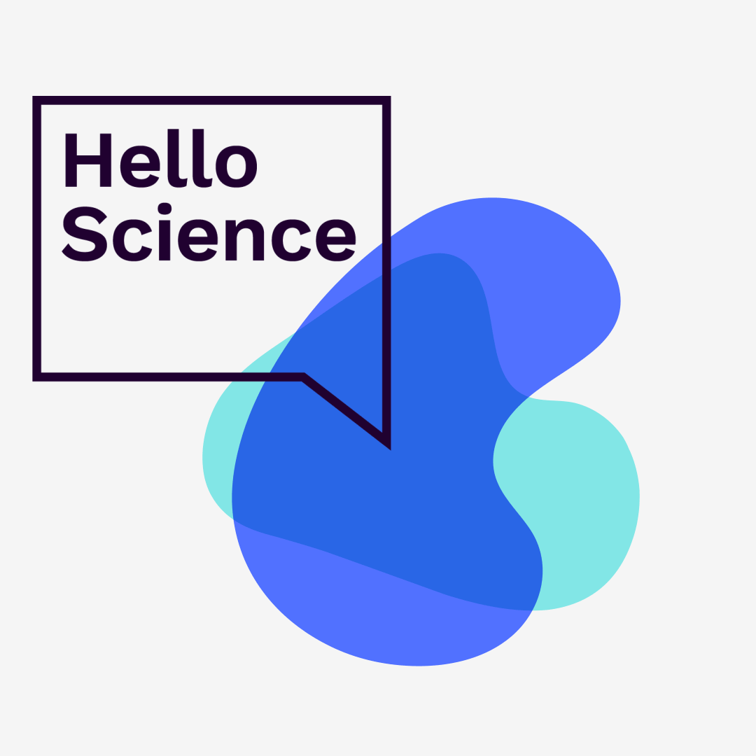
Hello Science is a portal that aims to connect people and resources in order to help bring meaningful ideas to life. The goal is to find sustainable solutions to the challenges we are facing today, inspired by the UN Sustainable Development Goals. The first challenge is focused on water.
The project is backed by Novozymes, the world’s leading producer of industrial enzymes.
The identity combines organic, fluid forms that are just like ideas which have yet to solidify into something concrete with serious typography and clear colours. The speech bubble logo adds a friendly touch and invites you to join the conversation; after all, the main focus is on exchange and collaboration.
See more at Helloscience.io
Website created by YeahYeah.
2018. Client: Novozymes
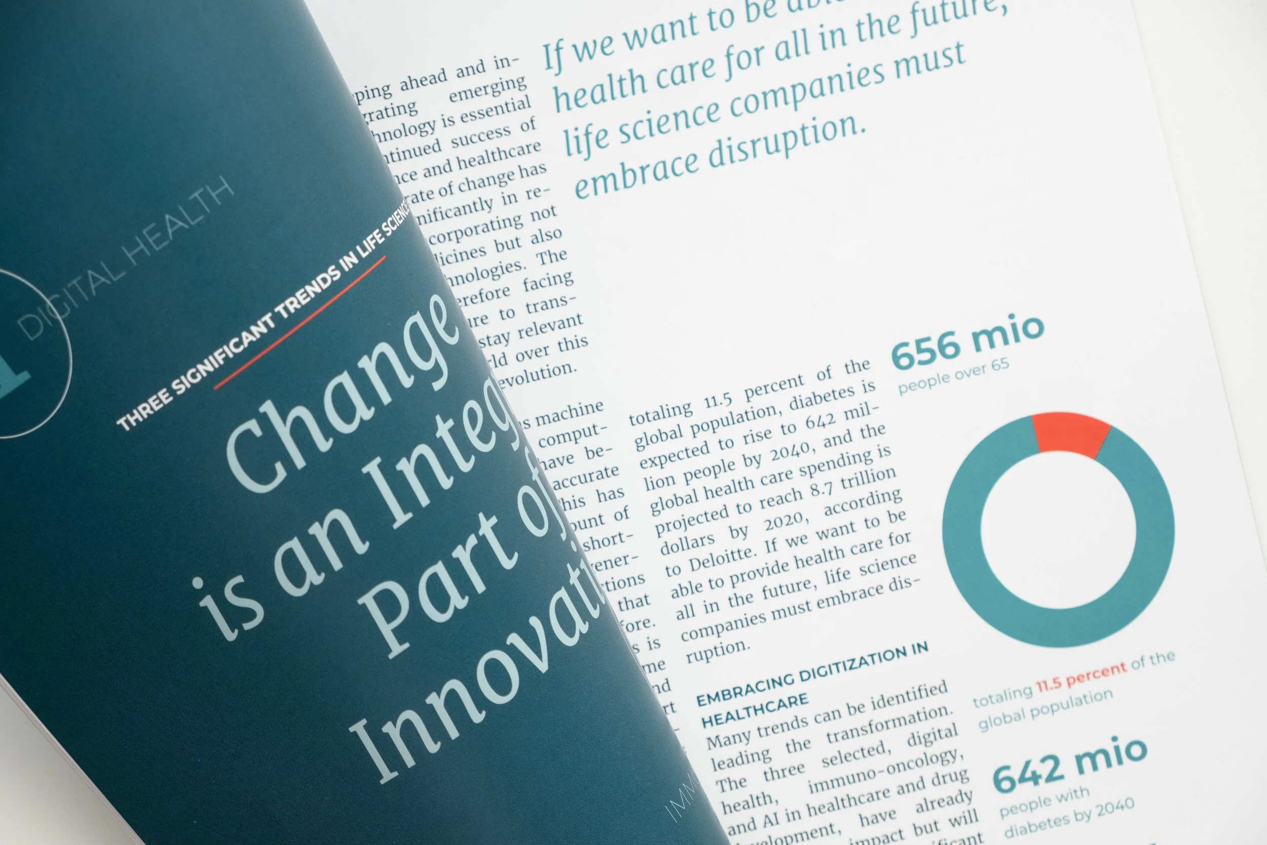
The Nordic Mentor Network for Entrepreneurship (NOME) is a Nordic and Transatlantic mentoring program that aims to improve the success rate of life science start-up companies located in the Nordic countries. The mentor network consists of high profile life science executives that mentor best in class start-ups. NOME aims to position the Nordic region in a leading position in commercializing promising startup companies in the life sciences.
NOME currently has 50 mentors and 18 enrolled start-ups. NOME is operated by Accelerace and funded by the Novo Nordisk Foundation. The initiative is represented in the Nordic region through partnerships in Sweden, Norway and Finland.
The first issue of the magazine was released to coincide with the NOME Annual Meeting in October 2018. Topics included a short history of the organisation and a look at current trends in Healthcare, with comments from NOME mentors.
Cover illustration by Tania Vicedo.
2018–19. Client: NOME/Accelerace
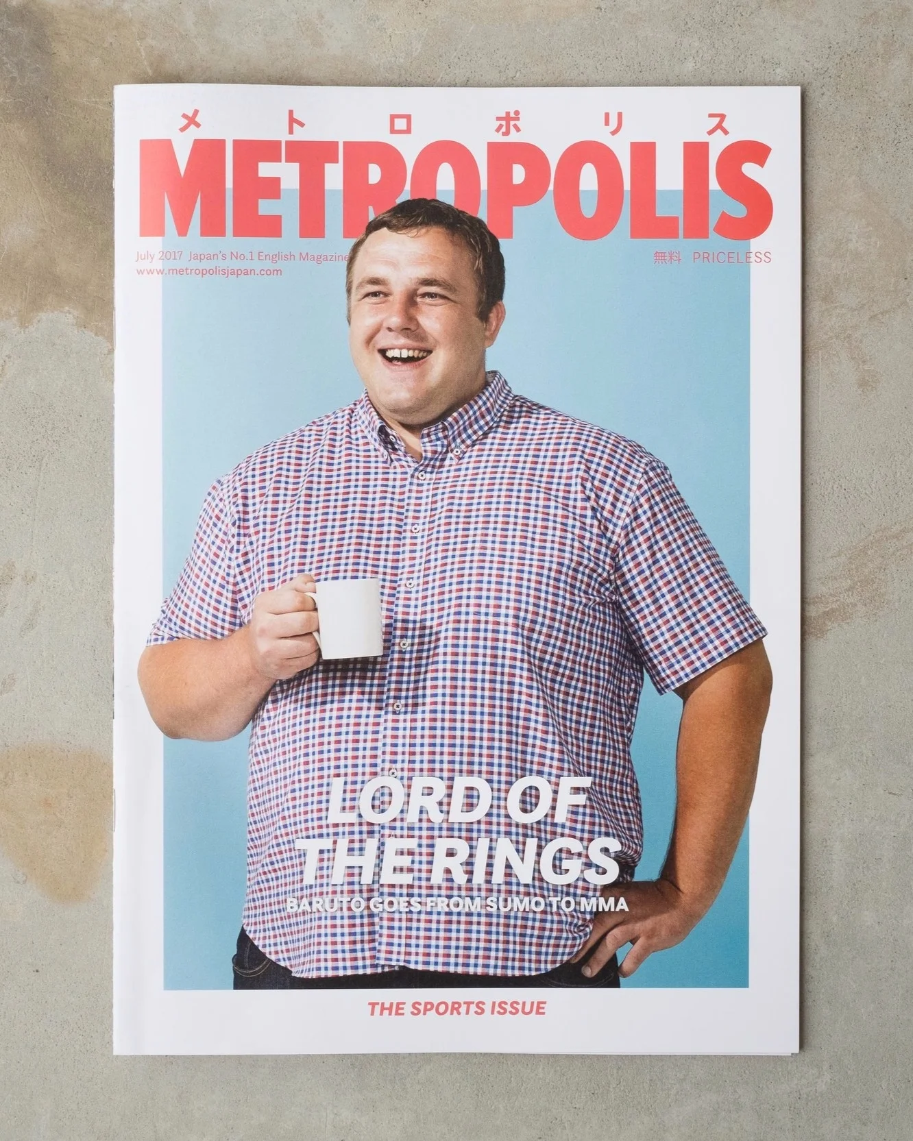
Metropolis is one of the most popular and longest-running English-language magazines in Japan and provides high-quality content in a free magazine. It is published monthly from Tokyo and available at over 600 distribution points in the Kansai area.
As Art Director, I was responsible for updating their layout with a fresher, more inviting look and designing the monthly issues.
I also functioned as a marketing and design consultant for the parent company, Japan Partnership.
2017–18. Client: Japan Partnership
REBBLS stands for Rising Entrepreneurs in BioBusiness and Life Sciences and is a network for ambitious young professionals in the Life Science sector. The main focus is on bringing together scientists and businesspeople to encourage new bio-businesses with innovative ideas.
The logo is based on the two B's in the name (for Biology and Business) and is a simplified representation of a DNA double-helix, the cornerstone of today's biotechnology. The new identity uses bright colours, characteristic typography and bold graphics to create a look that is both recognisable and versatile with a rebellious edge.
2017–18. Client: RREBBLS
Art direction and layout for a magazine celebrating the 10th anniversary of Accelerace, one of Europe’s largest seed accelerators.
The magazine also contains several well-integrated, custom-designed advertorials that go beyond mere marketing copy and provide branded content in an engaging design.
2019. Client: Accelerace A/S, Copenhagen, Denmark.
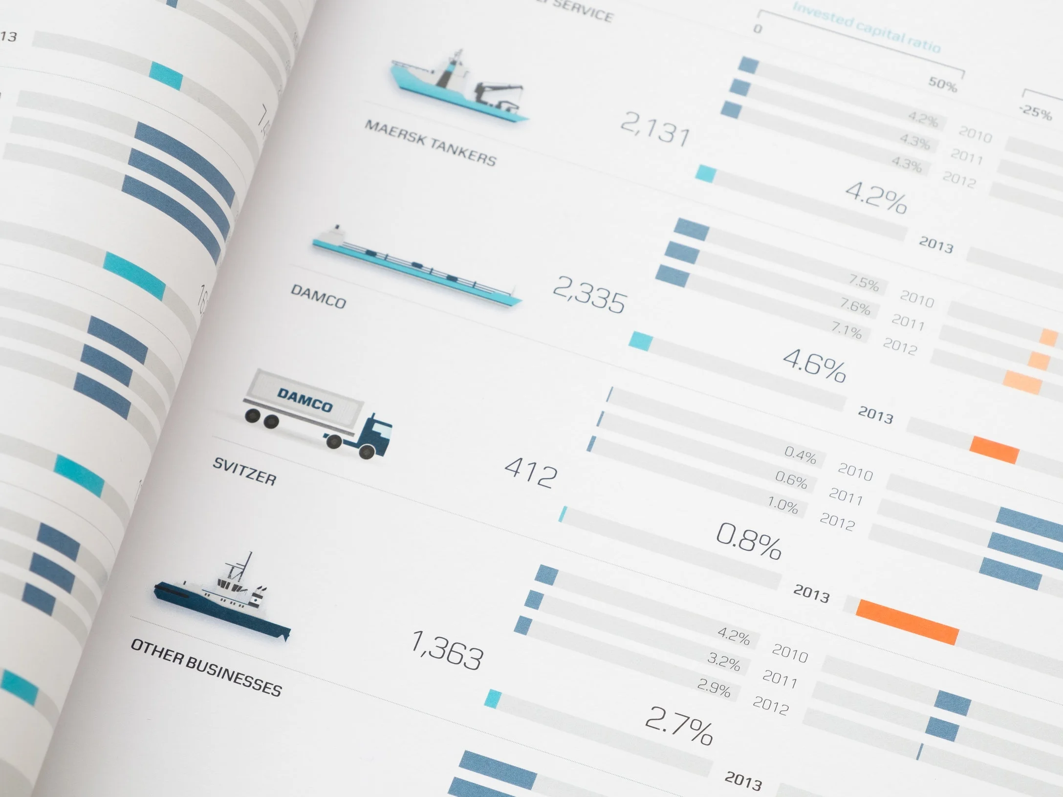
At e-Types Daily, I have worked on a number of corporate reports for Maersk Group, the world's largest shipping company, and affiliated companies.
I have been particularly involved in the design and layout of information-dense overview spreads and in designing info graphics.
I also oversaw the design of the 2013 Maersk Group Sustainability Report, which received high ratings from various agencies for it's easy-to-navigate layout and overall design and led the group on its way to a more transparent communication of their sustainability efforts.
At e-Types, 2012–2015.
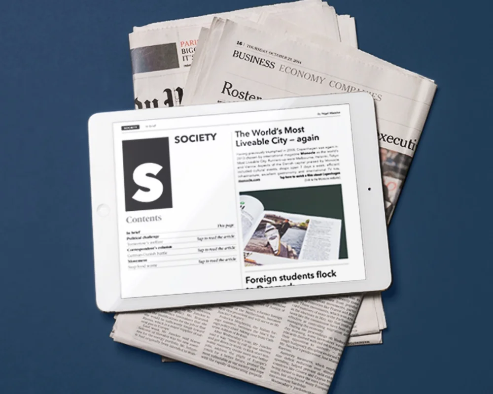
At e-Types Daily I successfully launched three magazines for our clients for both iPad and Android tablets based on the Mag+ platform.
The first of these was Focus Denmark, a quarterly English-language magazine published by The Danish Ministry of Foreign Affairs with business and lifestyle content from Denmark. The tablet version reflects the print design's serious and clean look in a touch-optimized format and adds features such as films, animations, and interactive info-graphics.
At e-Types, 2013–15
Issue no. 5 produced for e-Types/Danish Ministry of Foreign Affairs, 2016.
Visual identity update for a Danish market analysis and consulting firm that changed their name from Analysegruppen to the more international ag analytics.
While keeping some of the basic principles from their previous identity, the update included a new logo and typeface, updated colours and graphics and a new photo style as well as a brand-new website.
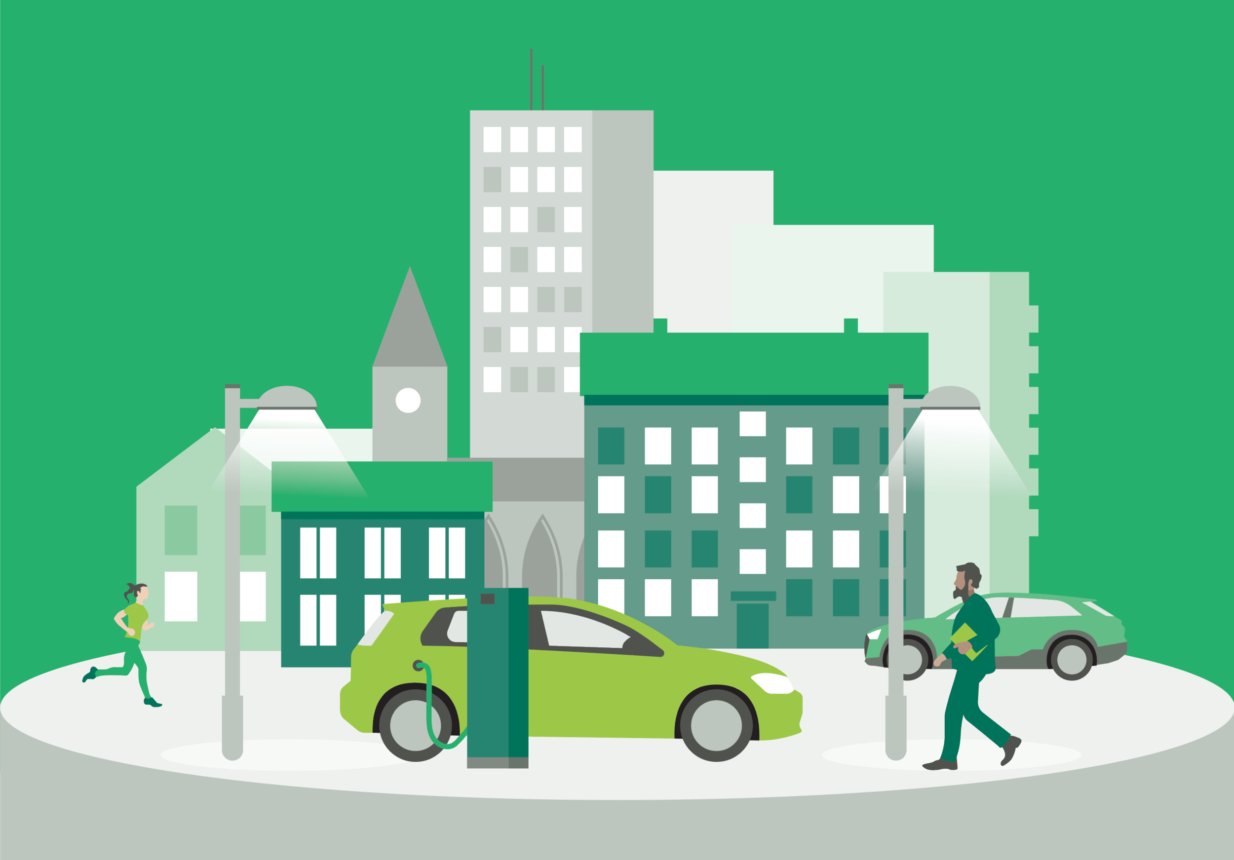
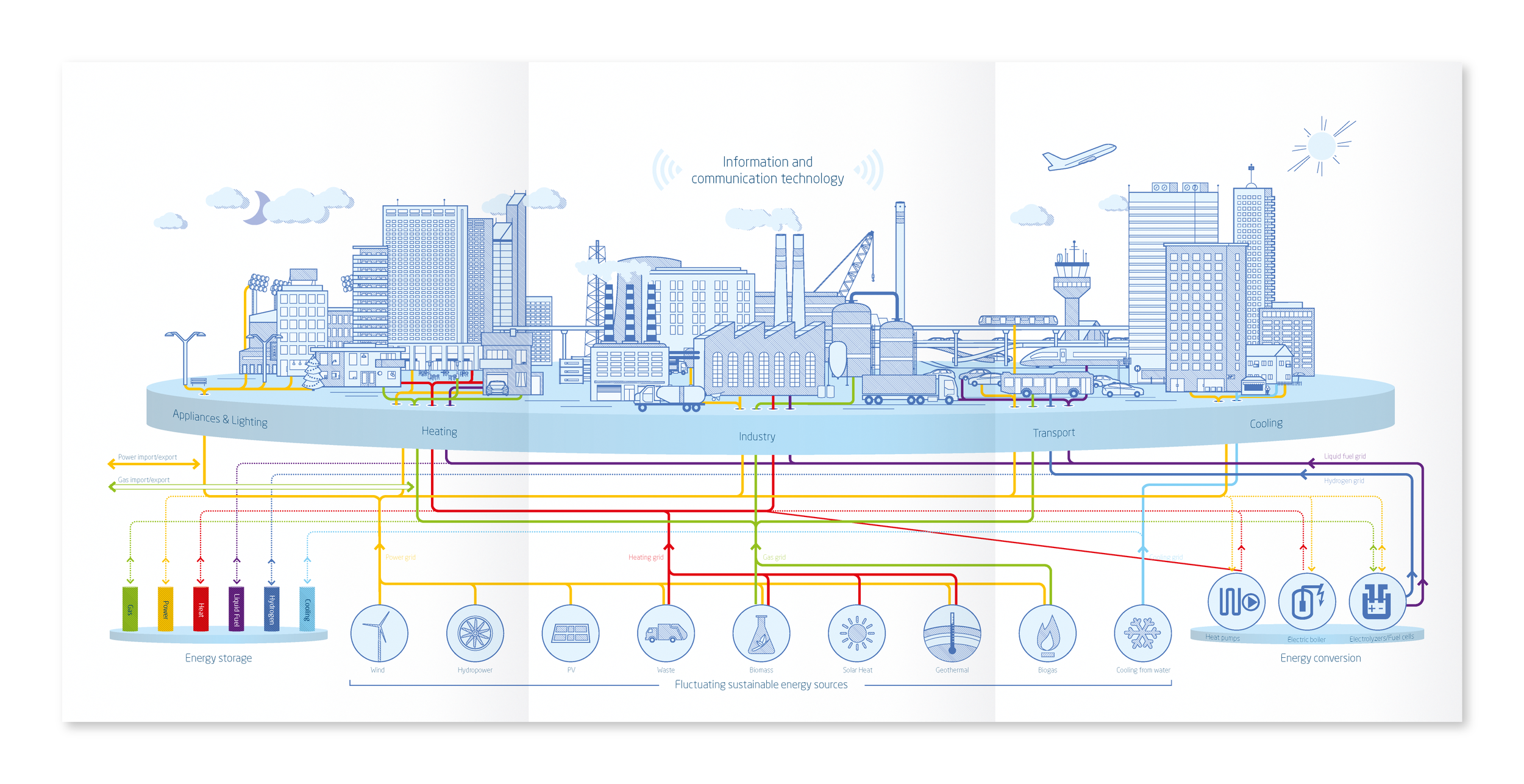
Illustrations for SEAS-NVE’s Annual Report 2018. SEAS-NVE is a customer-owned energy company, delivering energy to customers in Copenhagen and parts of eastern Denmark. The company owns and services the longest electricity grid in Denmark, produces their own energy at two off-shore wind farms and also provides high-speed internet and runs a network of car-charging stations.
The illustrations show all the different aspects of SEAS-NVE’s business operations and how the company creates energy to live life.
Throughout the report, icons and illustrative vignettes give life to the numbers and facts and allow for a dynamic flow throughout the publication.
See the full report here.
2019. Client: e-Types/SEAS-NVE.
As part of a larger identity update done by e-Types, I was responsible for the development of a set of icons and a new corporate illustration style for the world's largest producer of enzymes, Novozymes.
Novozymes uses info graphics to illustrate and explain the sometimes complicated biological and chemical processes behind their enzyme-based products. The new illustration style was designed to be precise and scientific, yet friendly and simple. Also, it was important that the illustrations could be easily reproduced by any designer in Novozymes' global network.
The colour palette is limited to the company's main colours to ensure a consistent look, no matter where the graphics are used. Splashes of green or white (on a gray background) can be used to emphasise certain elements. The illustrations themselves use two line widths, which allow a degree of detail that is often necessary for explaining complex topics and adds depth and hierarchy to the elements.
At e-Types, 2015
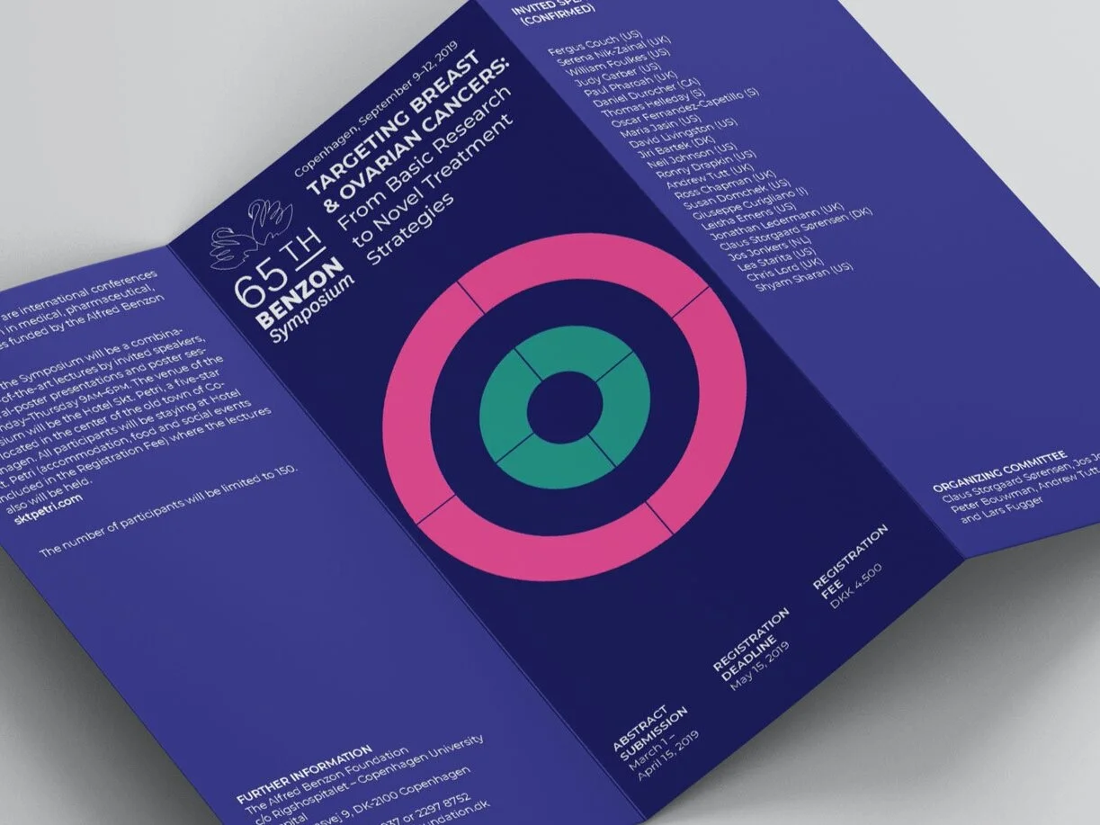
Logo and posters for a series of symposia by the Alfred Benzon Foundation.
Alfred Benzon was founded in 1952 by Bøje Benzon. The aim is to support medical and pharmaceutical sciences and relevant basic natural sciences. The Foundation sponsors one international symposium a year and a number of fellowships with emphasis on international exchange.
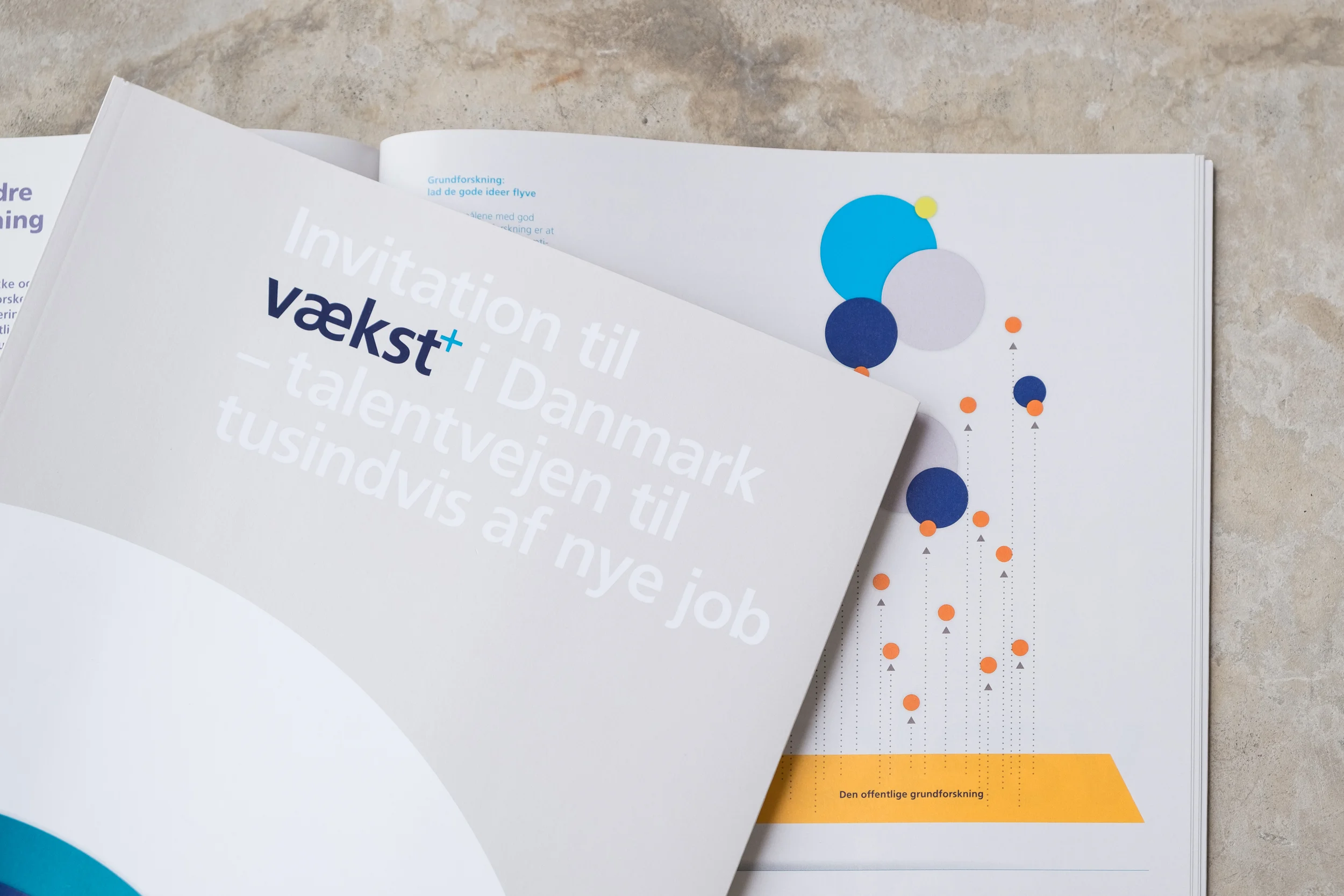
Design, layout and graphics for a publication by the Danish medical company Novo Nordisk making the case for an increased public focus on science and education in connection with plans by Novo Nordisk to hire several thousand new employees until 2022.
The brochure introduced 12 steps to increased growth and prosperity and used info graphics to explain the current situation, the economic benefits of increased public investments in education and basic research, and a short history of the company. Its release accompanied a one-day event of speeches and panel discussions with scientists, politicians, and business leaders at Novo Nordisk's headquarters.
During the production, I worked closely together with a multidisciplinary team of consultants and analysts to interpret the statistical data and express these findings in a clean, impactful design.
A full pdf of the publication can be downloaded from Novo Nordisk's website here.
At e-Types Daily.
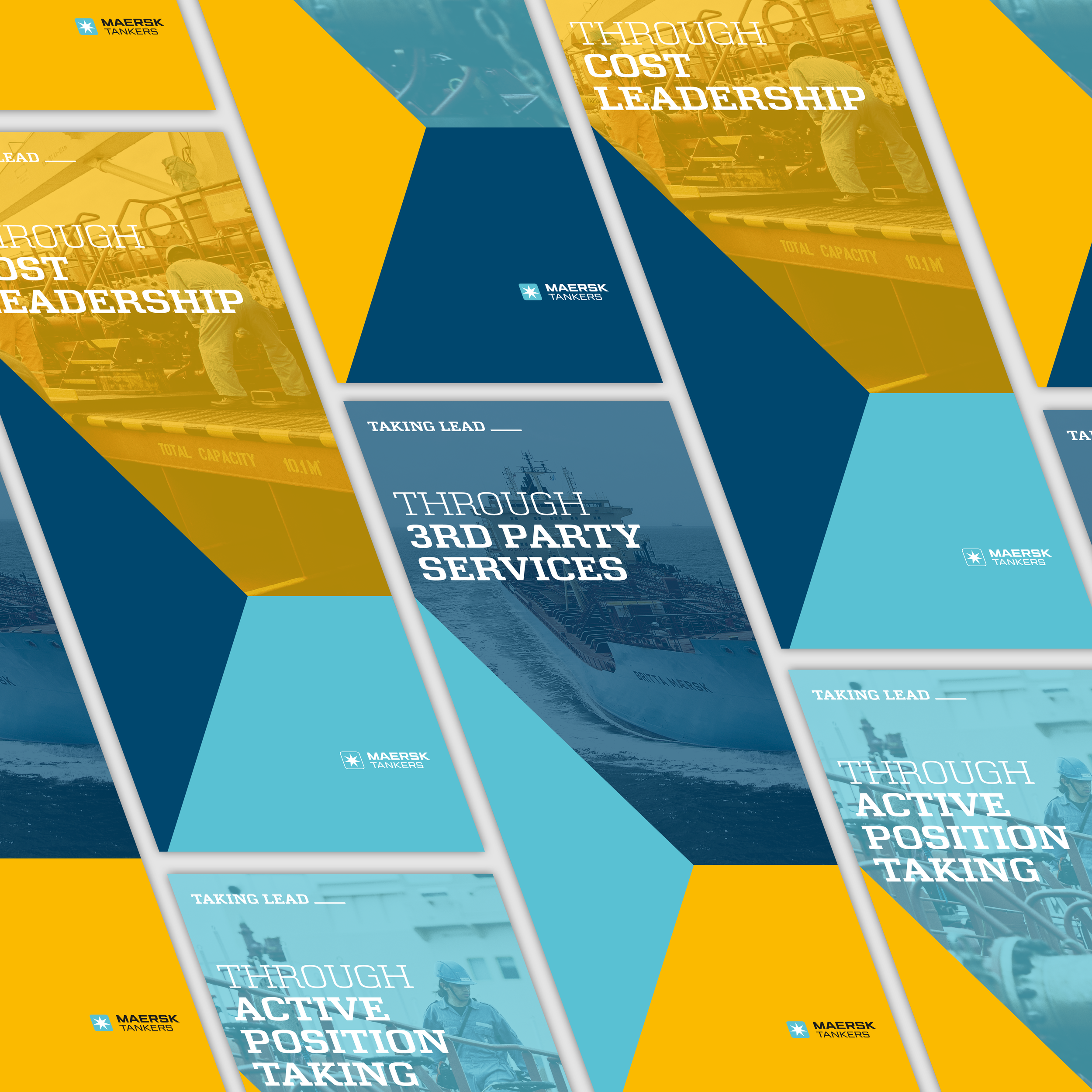
Identity for a company-internal initiative.
Based on the programme's three cornerstones, a simple and flexible visual system was generated. The three rhombus shapes each represent one of the programme's cornerstones and come together to form a hexagon, resembling an isometric cube. Zooming in, this model becomes an abstract shape with a dynamic, forward-moving expression, where single planes can be used as a container for images.
The TAKING LEAD_ wordmark can be followed by any of the three actions and is in itself an invitation to move forward and find one's own way to enable the company to take lead.
At e-Types.
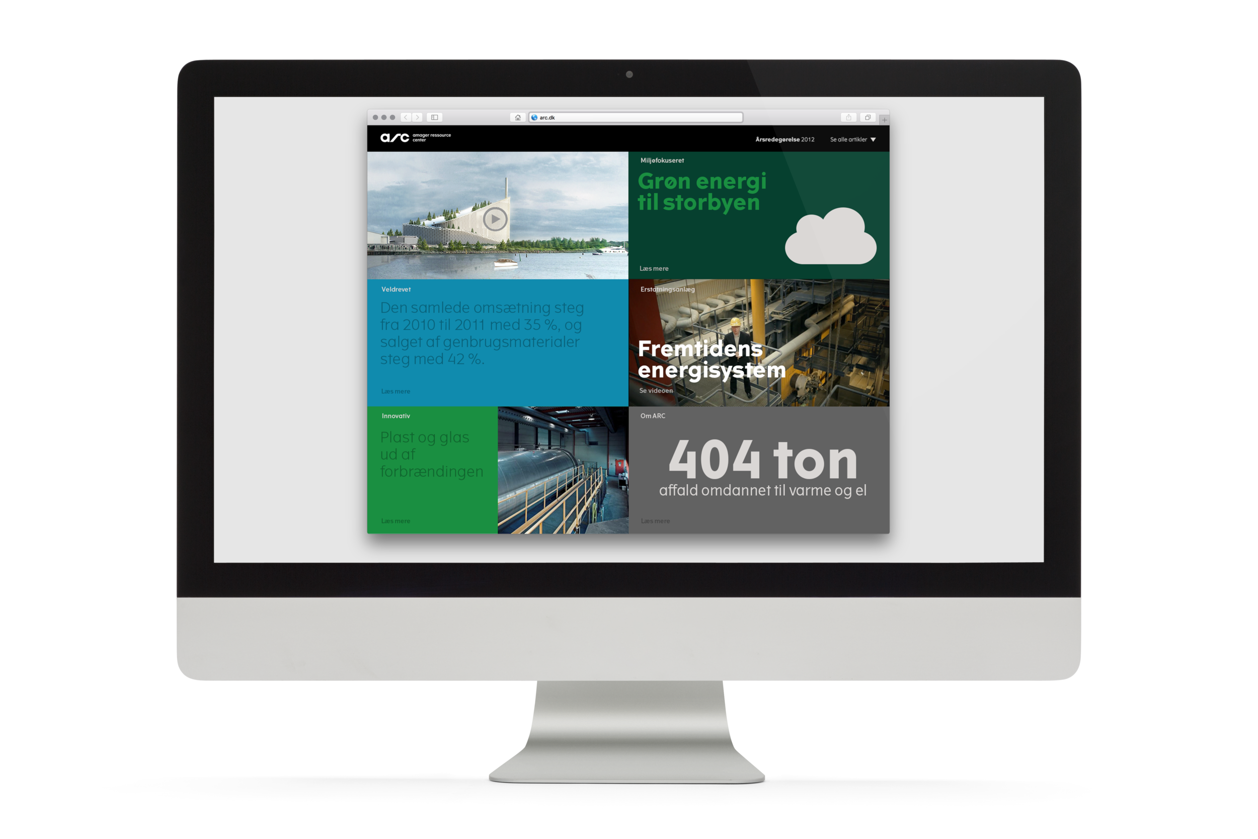
Digital annual report for the Copenhagen waste management company, arc. The website presents numbers and stories from the past year in an appealing format, using the identity's signature bold colours.
The home pages gives a quick overview of the year's highlights, among them a video about the construction progress on the spectacular new garbage burning plant. More articles can be accessed via a menu and are laid out in a magazine-like design, with images, pull quotes and large numbers that give a lively and varied reading experience.
At e-Types Daily.
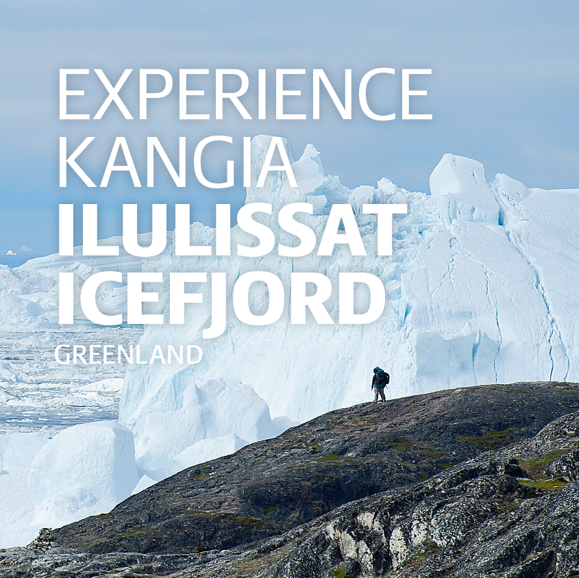
A travel guide to the UNESCO World Heritage Site Ilulissat Icefjord in western Greenland.
As the first guide book ever published for this area, it is a one-stop guide that includes practical tips, an introduction to the area's history and geological background, information about the areas ecological importance, and an illustrated guide to flora and fauna as well as illustrated directions for several hiking routes. Colour coded tabs assist in navigating the content.
The character of a park ranger serves as a guiding figure throughout the book with safety tips and interesting facts.
The book itself was designed to be rugged enough to survive in a hiker's backpack, with a rubber band to keep the pages together and a waterproof cover. The accompanying map is printed on "stone paper", an extremely durable and waterproof material with excellent recycling abilities. The colour scheme takes it cues from Greenland's icy nature, supplemented with a few high-visibility accents for important information.
At e-Types.
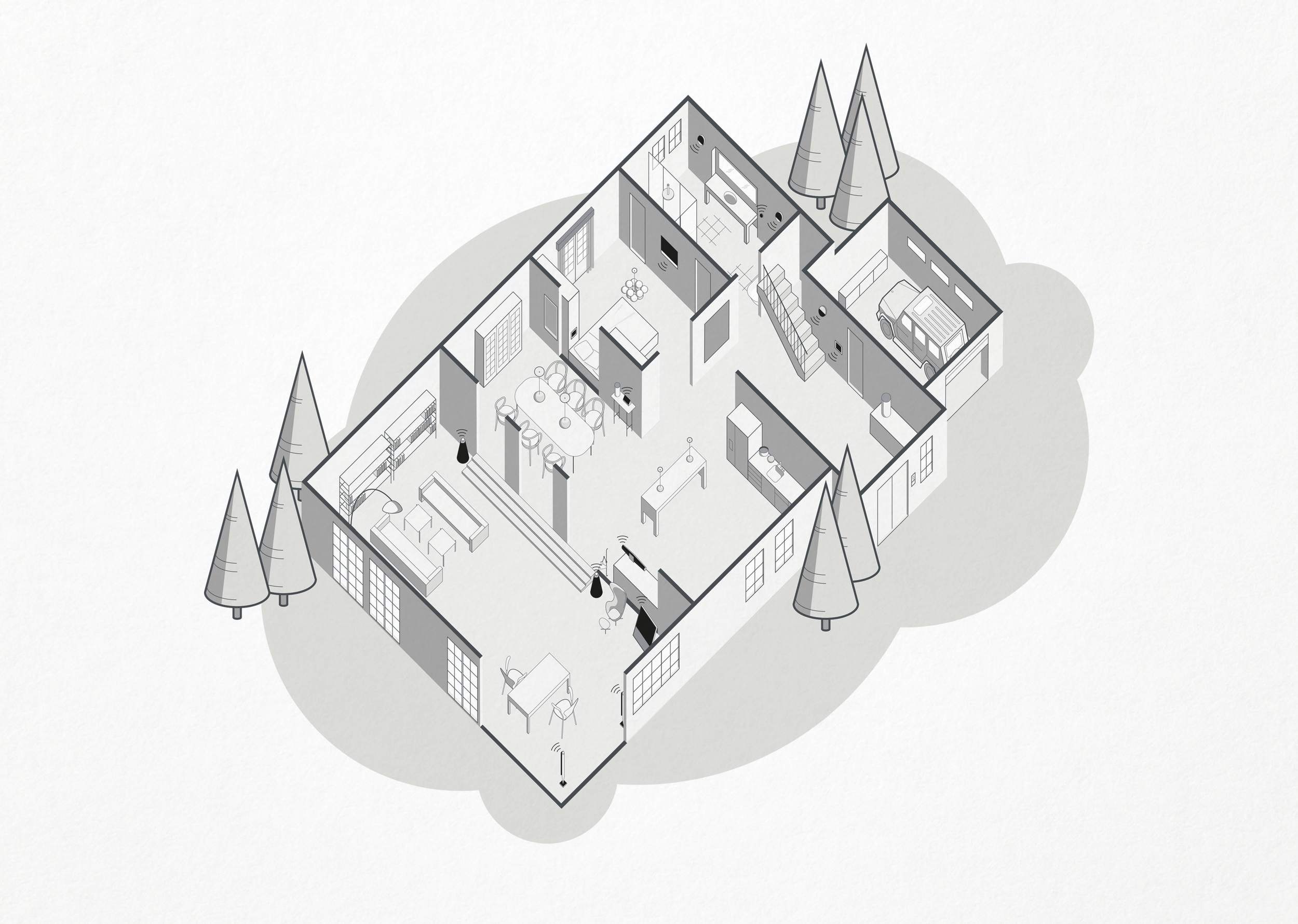
Isometric illustration of a model home, showing the possibilities of Bang & Olufsen's home control system.
The illustration was used for an in-store brochure as well as online.
See more here: B&O Solutions
Client: e-Types/B&O.
Udvikling (Development) is a free monthly magazine published by the Danish Ministry of Foreign Affairs, covering a range of political, cultural and economic topics from developing countries.
The tablet version for iPad and Android includes interactive infographics, animated titles and extra material such as film clips.
The magazine also released special tablet-only long reads.
At e-Types.
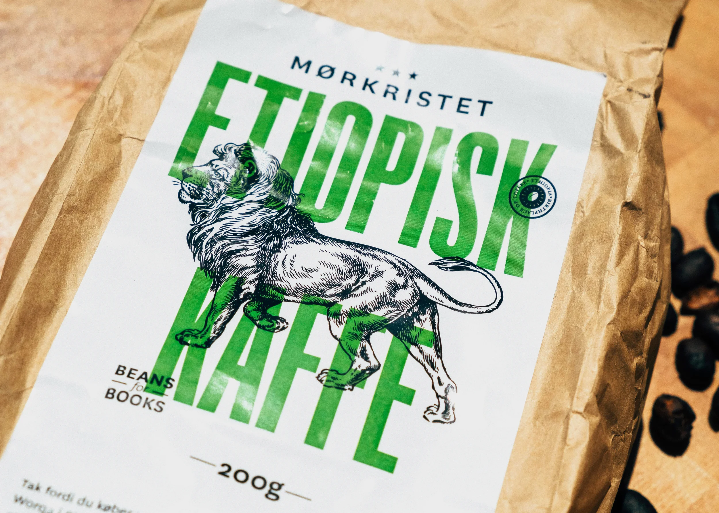
Packaging for a small non-profit project selling Ethiopian coffee to help a local school in southern Ethiopia raise funds for books, building repairs etc.
The labels use bright colours (green, yellow and red, the colours of the Ethiopian flag) overlaid on a drawing of a lion to grab the customers' attention. A short text at the bottom explains about the charitable nature of the project.
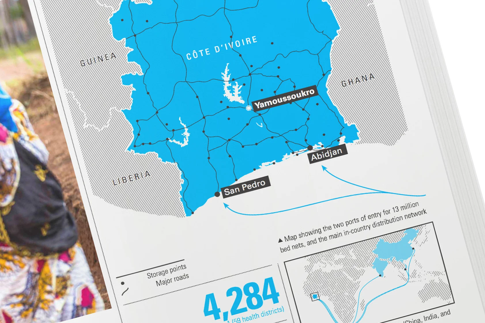
Concept, layout and graphics for the 2014 annual report of UNICEF's Supply Division. The goal was to move from the sober look of the previous reports to a more inviting, magazine-like layout and tell some of the amazing stories behind the numbers.
The design makes full use of the simple colour scheme of cyan and black, with simple and clear maps and graphics.
At e-types Daily.
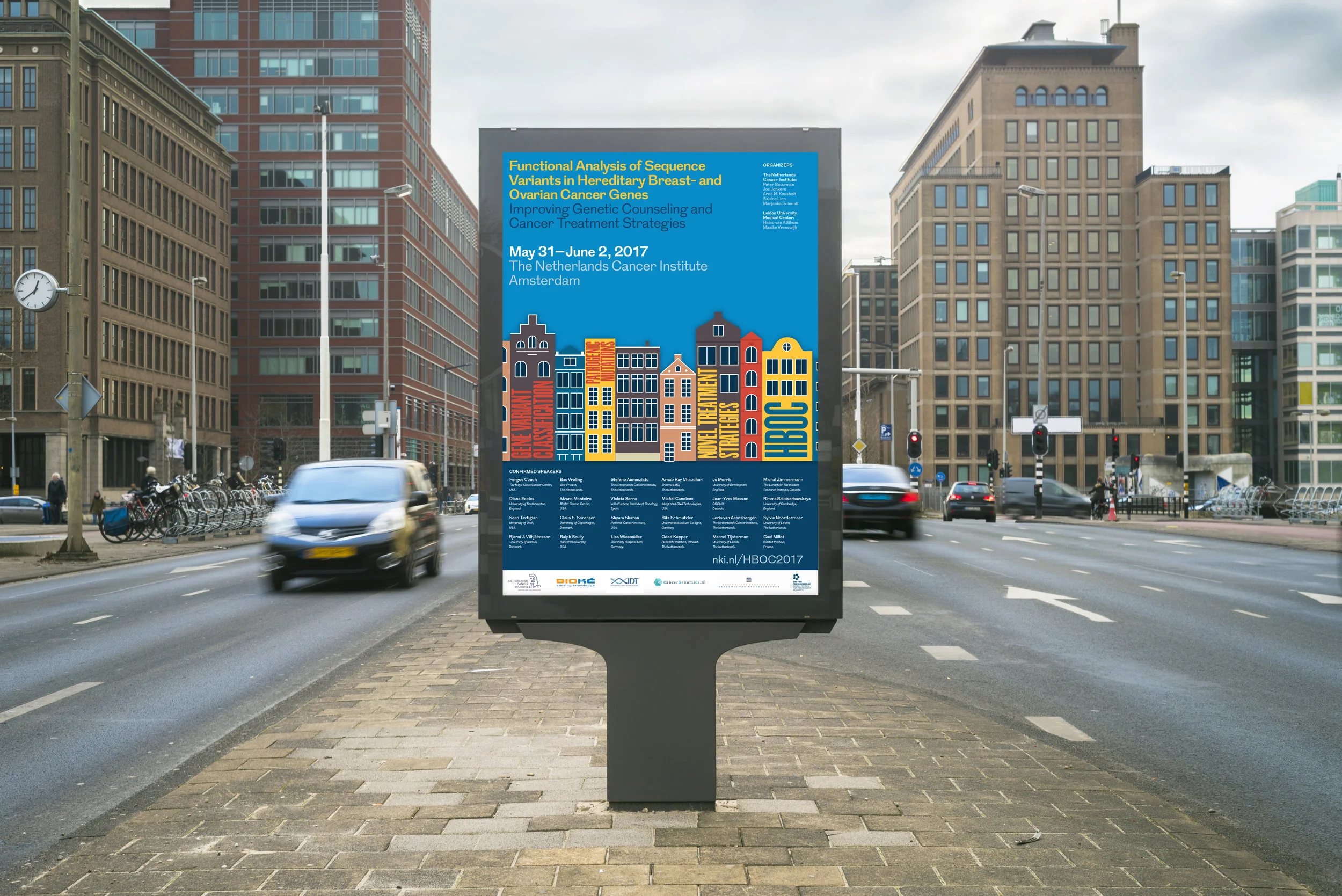
Design for a scientific conference in Amsterdam. Materials included posters, an abstract book, custom city map, name tags, presentation templates and web banners.
Illustration for a poster showing Maersk Tankers' future projects to further improve their vessels and services. The poster was part of the company's sustainability update 2016.
Client: e-Types/Maersk Tankers
Info graphics and illustrations for the 2012 annual report by The Danish Council for Strategic Research. The report presents some of the scientists and projects that have received funding during the previous year. The info graphics serve to illustrate and further explain some aspects of the featured projects.
The bird's eye-view of a fictional city served as a background for the content overview, since all projects that year were focused on improving society.
The full publication can be downloaded here.
Produced while working at e-Types Daily.
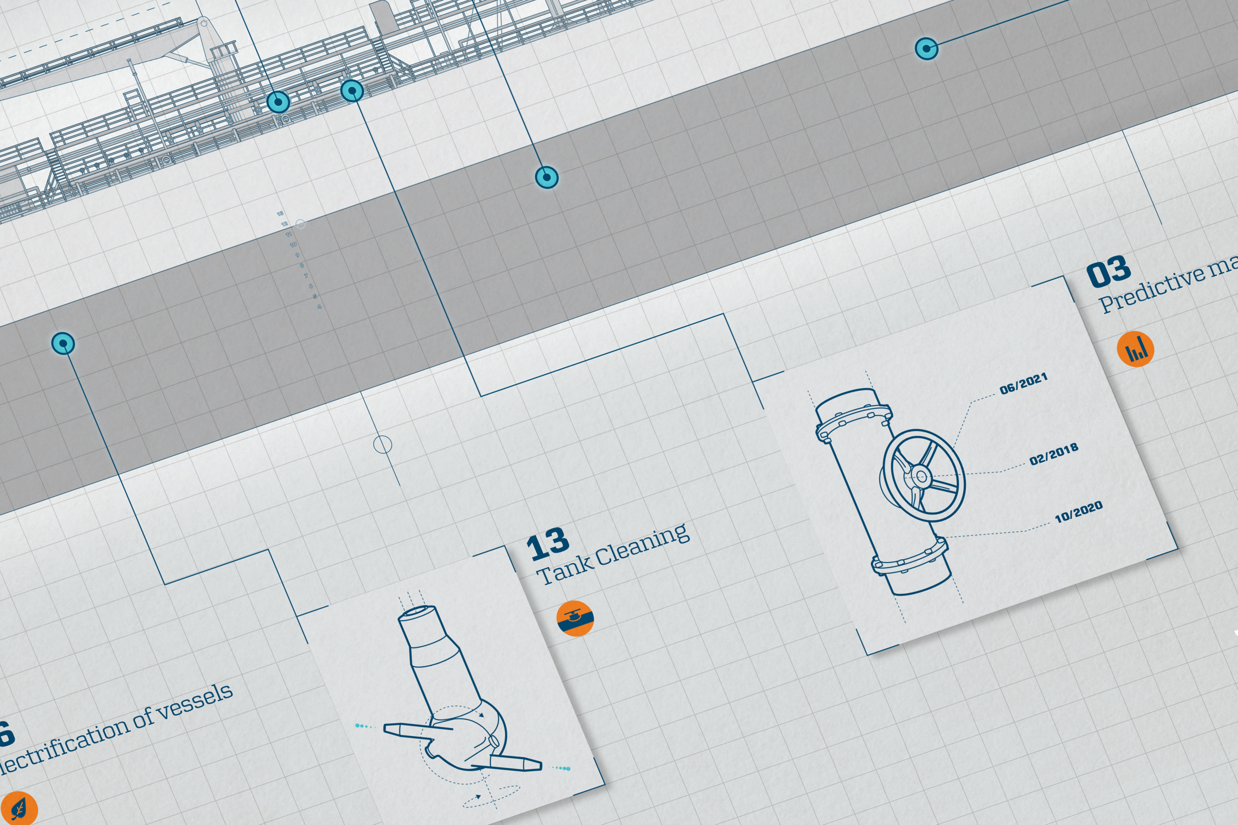
Illustration of a tank ship and icons for Maersk Tankers' Sustainability Report 2014 to show that year's focus on optimisation efforts on the vessels.
The graphics were used for the report itself and as a mega graphic for a conference room at Maersk Tankers' main office in Copenhagen.
At e-Types Daily.
Layout, graphics and covers for a bi-monthly magazine by the Danish Agriculture and Food Council.
At e-Types Daily.
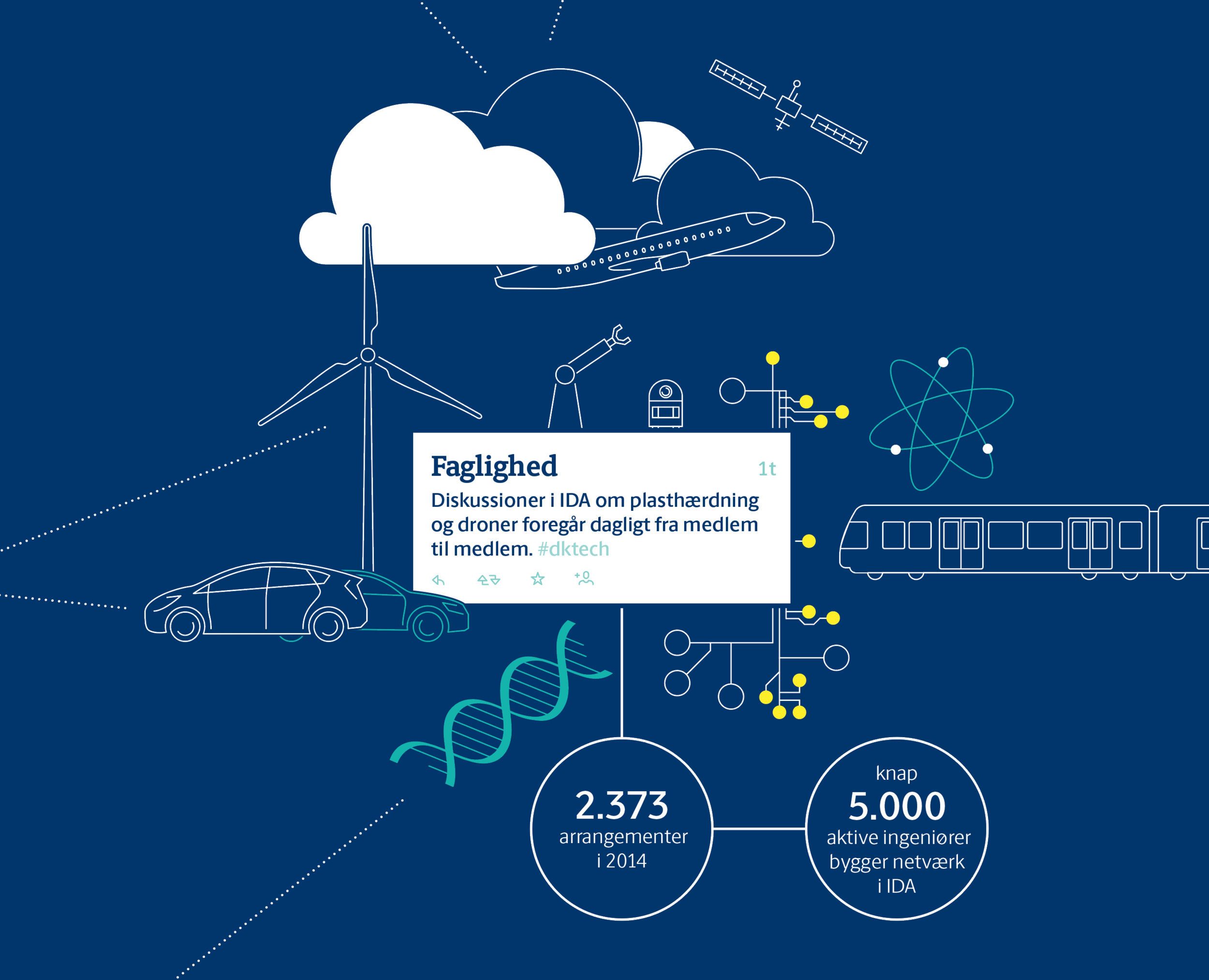
Poster illustration for the Danish Society of Engineers. The poster communicated key facts about the organisation, such as areas of activity, number of members etc.
The back of the poster functions as a leaflet when folded and contains short texts that further explain the structure and work of IDA.
At e-Types.
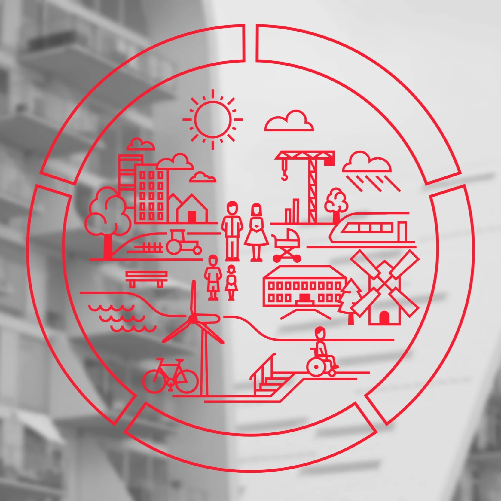
In connection with their new visual identity designed by e-Types, Realdania, a private association of home owners supporting philanthropic projects in architecture and planning in Denmark, needed various graphics to illustrate the organization's main focus areas, which are:
— Space for Everyone
— Denmark – Land of Opportunities
— Innovation in Construction
— Living Built Heritage
— Cities for People
These program areas are combined in the illustration of a city, which can be used as a background pattern in various applications.
Elements from this illustration are used in a model further explaining the five areas and again the form of separate graphics, identifying each of the programs.
Client: e-Types/Realdania.
Layout and supporting graphics for an annual collection of articles published by researchers at The Technical University of Denmark.
2015 produced while working at e-Types Daily.
2016 produced for DTU and e-Types Daily.
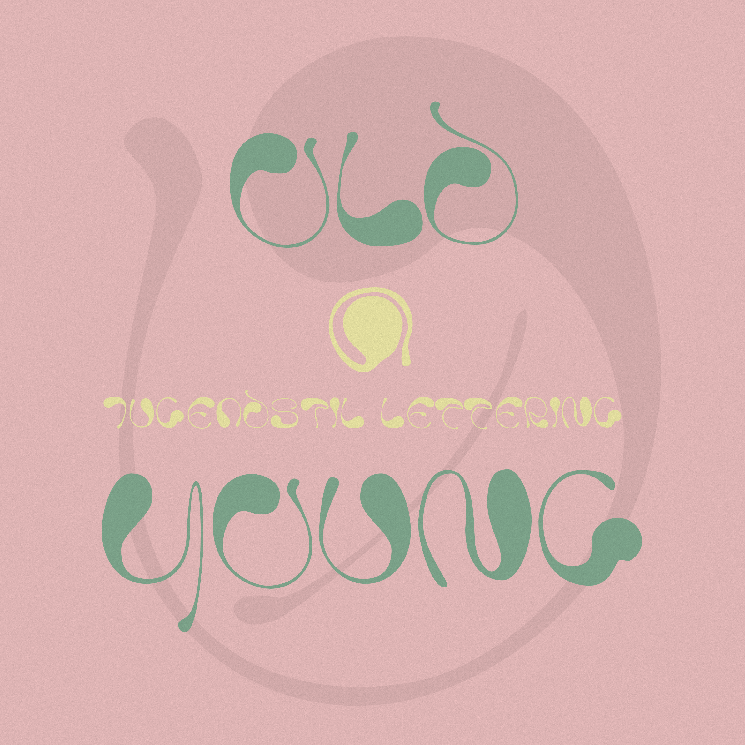
Typeface based on a cover of the German Art Nouveau magazine Jugend.